Dashboards
You can create dashboards and visualizations using a highlight.io data source. The data source exposes a query editor that lets you create custom queries to aggregate metrics derived from your sessions, errors, logs, and traces.
Getting started
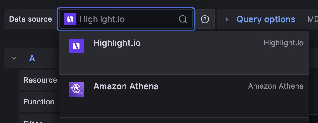
Once you've installed and configured a highlight.io data source, you're all set to create new visualizations using that data source. On any dashboard, add a new visualization and select the highlight.io data source you created earlier. 
Query editor fields
When you use the highlight.io data source, it is configurable with these fields:
| Name | Description |
|---|---|
Resource | The highlight.io resource being queried for these metrics: one of traces, logs, sessions, or errors. |
Function | The method used for aggregating data within a group and bucket, e.g. count, avg, p50. If the function operates on a metric, numeric fields from the linked project's data are shown as search suggestions. |
Filter | A highlight.io filtering expression can be used to include only matching resources. Follows the search syntax shown here. |
Group by | One or more categories to group the results by. Categorical fields from the linked project's data are shown as search suggestions. |
Limit N | If one or more "group by" categories are selected, the result groups are limited to the top N. |
Limit by function | If one or more "group by" categories are selected, this method is used to rank categories before returning the top N. |
Bucket by | The dimension used for bucketing data. Supports bucketing by timestamp or no bucketing. |
Examples
The following are a few example queries to help you get started with your own visualizations. You can also download these import these examples into your Grafana instance as JSON.
Frequent HTTP requests
All network activity captured by the highlight.io client is stored as a trace with span_name set to the request URL. To visualize how many of each of these HTTP requests are made by your frontend over time, you can filter for these types of traces with a filter span_name=("GET *" OR "POST *") and group on span_name. The limit 10 by count clause shows the top 10 matching results by their total count in the visualization's time range.

Slowest HTTP requests
To see the slowest HTTP requests, you can modify the metric and limit clause in the example above to use P95(duration). This will graph the P95 value of duration (in nanoseconds) and show only the top 10 slowest traces in the visualization's time range.

Error frequency
If you want to monitor the number of errors over time to see if a new release introduced a new type of error, you can graph the error count and group by service_version.

Error frequency
If you want to monitor the number of errors over time to see if a new release introduced a new type of error, you can graph the error count and group by service_version.
